Improved user satisfaction by 40% through enhanced transparency
Platform: iOS / Android
Client: Allianz Private Health Insurance
Timeline: Jun 2016 – Aug 2017
Role: Lead UX Designer
My Role & Scope
As Senior UX Designer, I owned the complete UX concept and worked across teams, including engineering, business and legal.
- Led UX strategy, information architecture, interaction and UI design
- Designed core user flows and component logic
- Conducted user research, testing and evaluation
- Worked closely with developers, product managers, business owner and legal
- Supported rollout and qualitativ assurance across iOS/Android
The Challenge
Before the redesign, users had to upload photos of their receipts via desktop – no mobile access and iOS App, no feedback, no transparency. Many preferred mailing their documents, which caused delays, additional effort, and high processing costs on both sides.
Users expected a clear, fast, mobile-first way to submit and manage their health-related claims. Instead, the experience felt opaque, unstructured, and often insecure – especially in stressful medical contexts.
What we learned:
Through usability tests, feedback loops and usage data, we uncovered 3 core friction points:
- Lack of real-time feedback after submitting documents
- No transparency about where the claim is in the process
- No indication when reimbursement would happen
- No clear benefit in using the app over email or mail
This lack of visibility led to distrust, support calls, and poor digital adoption.
“Can I track it somewhere? Do I get a confirmation?”
“I uploaded my bill – but I don’t know if it worked.”
Research & Insights
We conducted interviews, surveys, and usability tests. Based on behavioral patterns, we identified three core submission types:
- Instant submitters (right after doctor visit)
- Batch submitters (monthly/quarterly)
- Annual submitters (year-end consolidation)
We also learned that:
- Users created Excel spreadsheets to calculate whether a submission was worthwhile, because if you didn’t submit an invoice up to a certain amount, you would get money back
- They wanted process transparency and real-time guidance
- They were frustrated by long postal handling times and additional costs (stamps, envelopes)
Key user questions:
- What has happened?
- What happens next?
- What do I need to do?
- When will I get my money?
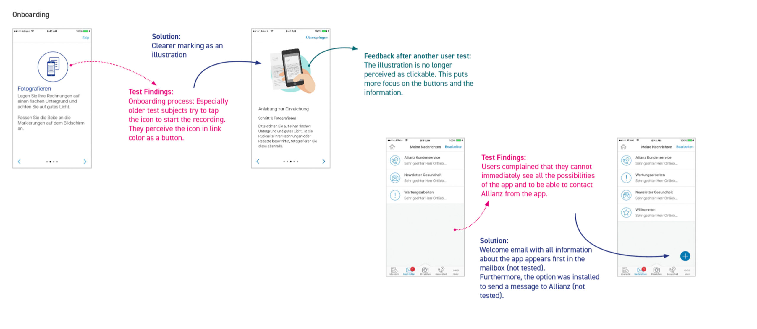
1. A notice screen that appears before photographing receipts. During testing, we observed that the simple, blue-toned illustration—consisting of a circle and a „smartphone with document“ icon—was mistaken by many users, particularly older ones, for a button. As a result, we decided to use colorful illustrations, which were no longer perceived as buttons.
2. On the „Messages“ page, users couldn’t find all the ways to contact Allianz through the app. In the initial version, this section was only intended for receiving messages. After testing, we considered expanding this area to be bidirectional by adding a button that allows users to send messages to Allianz.
Strategy & Design Principles
Our UX strategy was driven by a clear alignment between user needs, business objectives, and product goals.
Business Goals:
- Acquire 20,000 new users by end of 2016 (beyond 62,000 legacy users)
- Reduce support center call volume by 60%
- Position Allianz as digital, simple, and fair
Product Goals:
- Simplify claims submission and guidance
- Improve visibility on services and deductibles
- Enable real-time push notifications for process updates
- Introduce 24/7 remote health services
Design Principles:
- Mobile-first and real-time by default
- Use plain language and clear visual hierarchy
- Avoid reinventing: integrate the best solution (→ Fileee SPA)
- Ensure full accessibility compliance
- Modular logic for reusability in other journeys
The Solution
We didn’t just build a better form – we changed our approach.
We redesigned the claims journey around four core user questions:
- Introduced Fileee SPA for smart photo capture, edge detection and QR handling
- Created real-time feedback and confirmation after upload
- Designed timeline-based tracking of claims with plain-language status
- Replaced jargon-heavy UI with clear icons, higher contrast and consistent logic
- Integrated push notifications and structured guidance to avoid uncertainty
- Improved onboarding and clarified action prompts
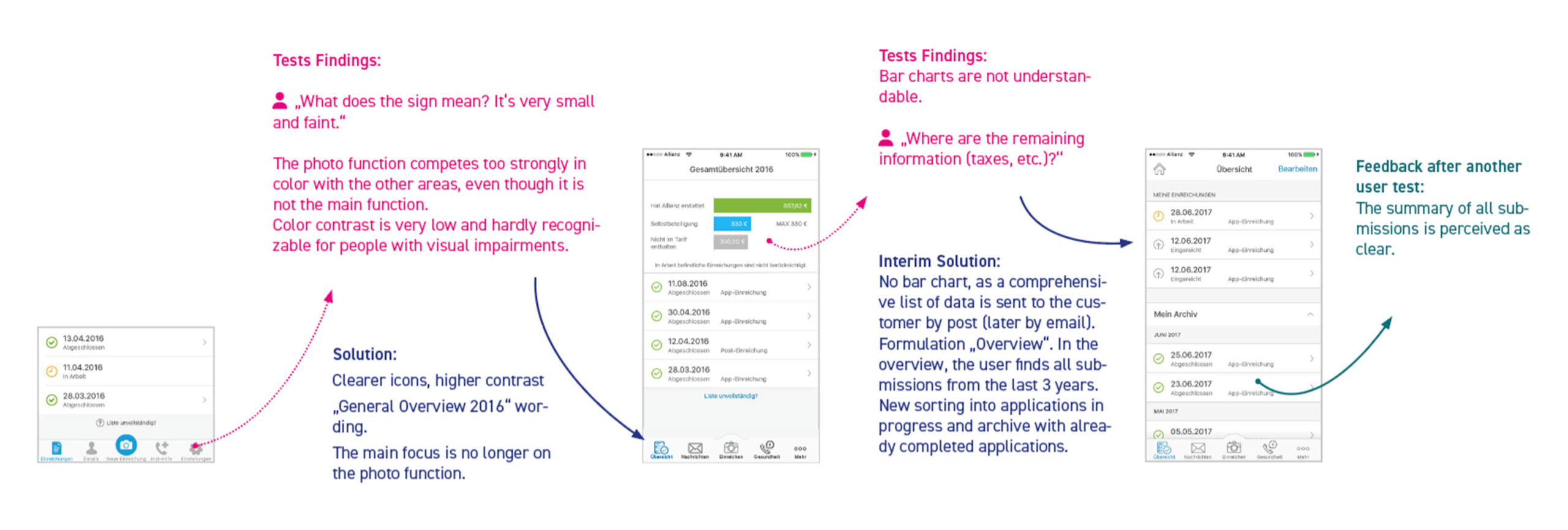
1. Many users were unable to clearly identify the icons in the navigation bar. At that time, there was no consistent style for the icons. We decided to redesign the icons completely, giving them a uniform appearance and clearer design. For example, the gear icon (representing settings) was replaced by three dots, which users identified much more frequently as „Settings.“
2. Additionally, we increased the contrast and color of the icons, as many users had difficulty recognizing the gray, inactive icons in the initial version. Active icons were changed to blue for better visibility.
3. In the first draft, a bar chart was included to show the breakdown of reimbursements (from the submitted receipts), distinguishing between „Reimbursed by Allianz,“ „Deductible,“ and „Not Covered by the Plan.“ However, users expected more details, such as „Taxes.“ As a result, we temporarily removed the chart, and user feedback indicated that the list of status updates was now much clearer. The chart was postponed to a later development stage.
Results & Impact
- 📲 +100,000 installs in App Store & Google Play
- ⭐ App rating: 4.7 (iOS) / 4.6 (Android)
- 📉 –60% fewer support calls (measured vs. old flow)
- ⏱ ~70% faster submission completion (SPA vs. legacy upload)
- 💬 Users called the app “easy”, “reassuring”, “finally transparent”
- 🔁 The SPA solution was scalable and reused in other Allianz digital products
- 💸 Users also save money on postage and materials
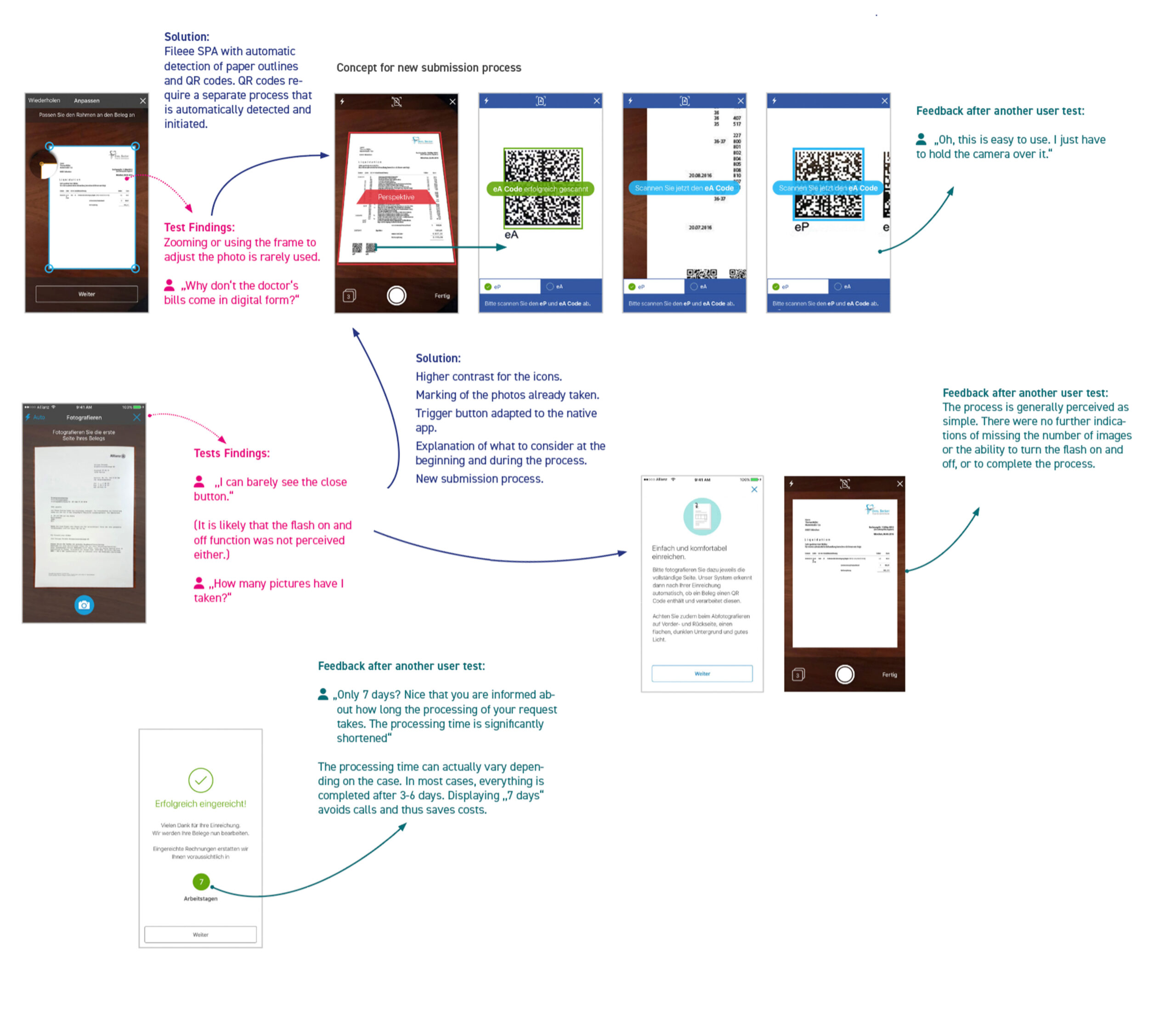
1. Our initial development of a photo function that required users to manually mark the edges did not work very well. With the integration of Fileee’s SPA, this process was significantly improved and automated (automatic edge detection). Additionally, with the SPA, QR codes on invoices could be scanned automatically, and the information behind them was captured and sent to Allianz. Users appreciated this simple scanning process, often commenting, „Oh, the process is very easy—you just need to hold your smartphone over it.“
2. The contrast of the icons (e.g., for closing/exiting the photo process) was too low, making them hard to recognize during user tests. We responded by changing the color from blue to white, ensuring better visibility against the dark background. Furthermore, the icons received a significant redesign, which greatly improved their recognition and functionality.
3. Additionally, we decided to display a notice before starting the photo process, briefly explaining that users should pay attention to certain factors (e.g., lighting, avoiding hard contrasts, etc.).
4. A screen is shown after submitting a document, indicating approximately how long the submission process will take. Users appreciated this, as previously there were no such indications. This also resulted in fewer calls to Allianz, leading to cost savings.
Reflection & Learnings
Transparency isn’t a feature – it’s a feeling.
- Simple phrasing like “You don’t need to do anything now” dramatically reduced support calls
- Accessibility and clarity are not “nice-to-haves” – they were critical to adoption
- Understanding user behavior types allowed us to design for everyone, not just for “ideal” use cases
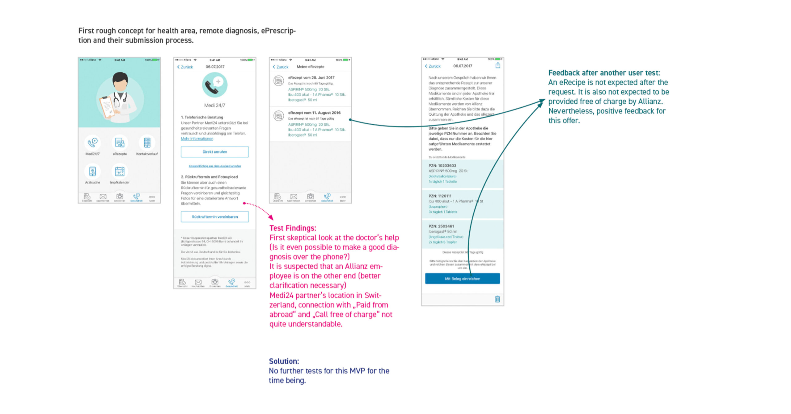
In this case, we outlined the process for ePrescriptions.
1. There were doubts about the feasibility of an online consultation (which includes the option for a callback within the ePrescription process) with a doctor. It was suspected that an Allianz employee might be on the other end, consulting with the doctor. As a result, we decided to exclude this feature from the first development phase of the app.
2. Additionally, there was positive feedback indicating that users did not expect ePrescriptions after an online consultation. They also did not expect Allianz to cover the costs of such services.
Get My Resume and Portfolio as Printable PDFs
Daniel Treufeld Senior Designer UX / UI