Rebuilding Allianz’s digital loyalty platform to make it scalable, accessible and easier to use for customers and content teams.
Platform: Web
Client: Allianz Germany
Timeline: Jul 2018 – Jan 2020
Role: UX/UI Designer (Lead)
My Role & Scope
- Defined information architecture and interface logic
- Led interaction and visual design
- Prepared usability and conducted hallway tests throughout the process
- Collaborated with developers and external service providers
- Acted as UX advocate in a technically restricted project environment
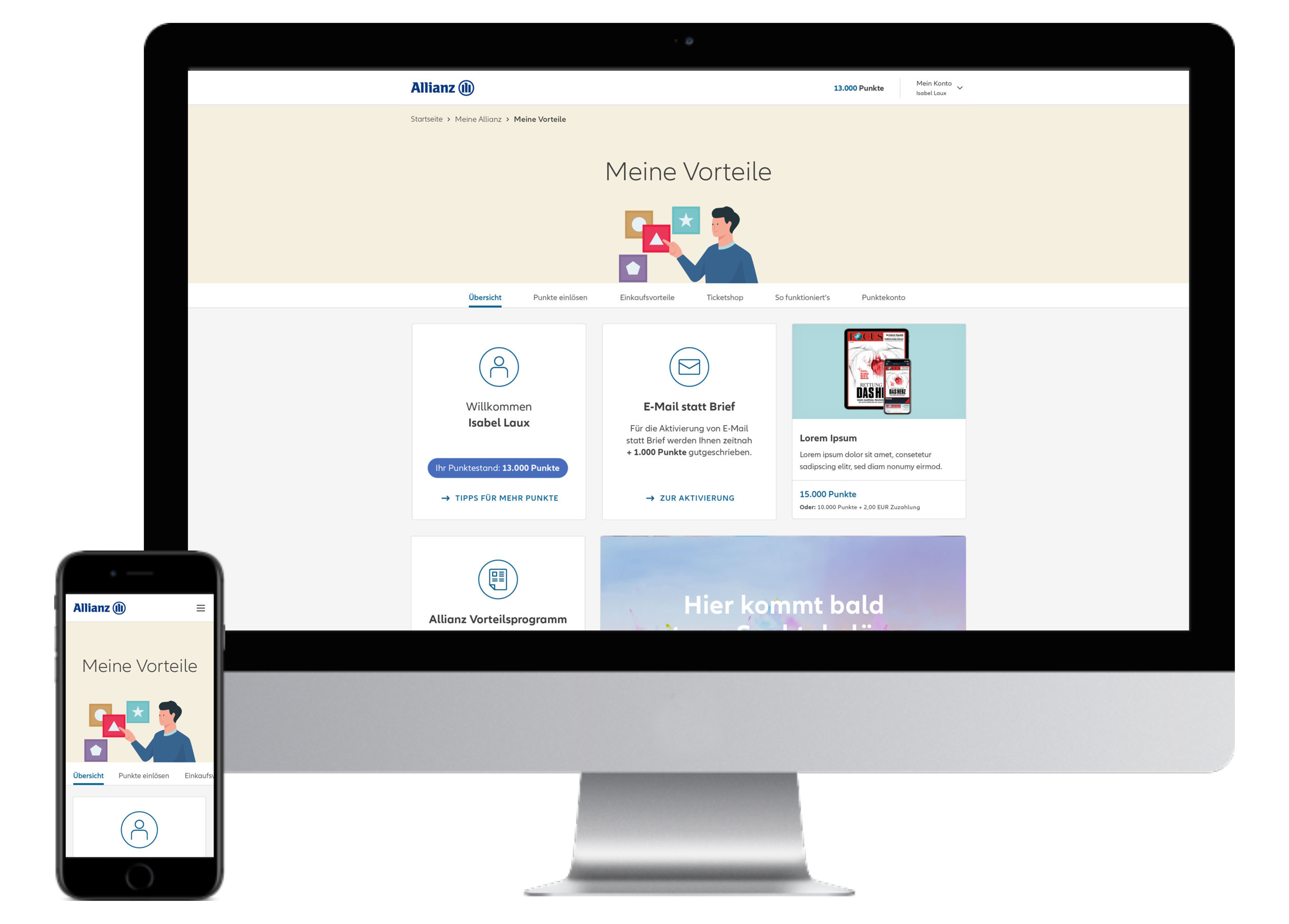
The Challange
The legacy version of the Allianz Loyalty Program:
- The old platform was available only on desktop
- Was not barrier-free (accessibility issues)
- Had poor navigation and findability of key products
- Used a points-based level system that most users didn’t understand
- Provided no communication during purchase flow (no emails or status updates)
- Lacked newsletter flexibility and author control for promotions
- Offered no ability to combine shopping carts due to fragmented backend APIs
Result: Confused users, limited flexibility for editors, and reduced conversion.
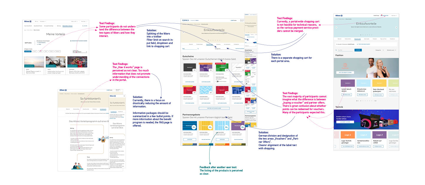
1. In an older version of the overview, many users didn’t understand the difference between various filters. We addressed this by clearly separating the filters, using more intuitive elements like dropdowns, and improving the labeling.
2. The „How It Works“ page was often described as too text-heavy. We significantly reduced the text without compromising the meaning.
3. Due to technical constraints, we couldn’t implement a universal shopping cart. Instead, each page, especially those integrating different service providers for products, required its own individual shopping cart.
4. In one test, some users didn’t understand the difference between „vouchers“ and „offers.“ We resolved this by separating the two sections on the page and clarifying the wording.
5. User feedback showed that the adjusted areas were now much better understood.
Research & Insights
- Most users couldn’t distinguish between voucher purchases and partner offers
- The system logic of levels and points wasn’t transparent
- The “How it works” page was overwhelming and not helpful
- Accessibility audits (e.g. Wave Tool) revealed missing ARIA labels, broken landmarks, and unclear screen reader output
- Checkout process lacked early visibility of loyalty point deduction
Strategy & Design Principles
Business Goals:
- Increase sales of rewards, tickets and gift cards
- Boost login rates to the Allianz portal
- Enable marketing flexibility via self-service content management
- Establish the loyalty program outside the secure portal long term
Product Goals:
- Create a more intuitive structure and layout
- Improve accessibility and responsiveness
- Simplify promotion and communication tools for editors
- Support multiple providers despite fragmented payment systems
Design Principles:
- Mobile-first layout for cross-device usage
- Modular filter and navigation design for clarity
- Stronger visual separation between product types
- Lightweight content + FAQ instead of information overload
- Progressive accessibility improvement strategy
The Solution
We rebuilt the platform with the constraints in mind – and focused on clarity, usability and flexible authoring.
- Introduced clearer segmentation between “Vouchers” and “Partner Offers”
- Redesign of filtering logic (toolbar + input + dropdown)
- Unified product display with simplified labels and better hierarchy
- Each product section now has a separate cart due to backend limitations
- Users now see loyalty point impact at each step of checkout, not just at the end
- “How it works” was replaced with bite-sized info + linked FAQ
- Accessibility improvements planned, incl. ARIA roles and screen reader hierarchy
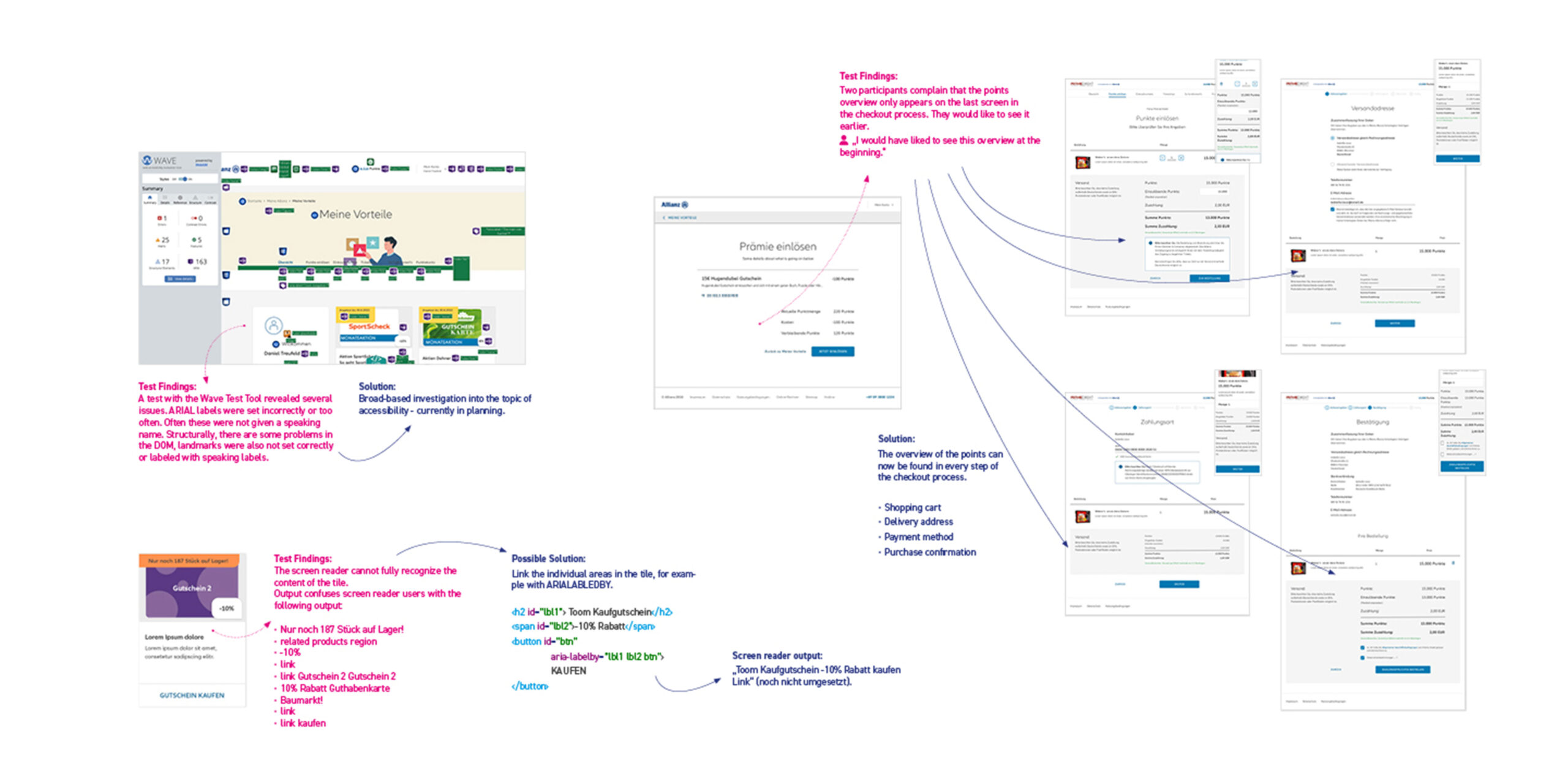
1. A screen where the Chrome plugin „Wave“ has been launched. With the help of this and other plugins, we were able to identify and address accessibility issues for the first time, as it highlights various problems and suggests solutions.
2. Using Apple’s VoiceOver, we discovered that the product tiles were not being read out correctly. By restructuring the tiles and adding ARIA labels, we were able to resolve this issue.
3. Some users complained that the display of points to be redeemed only appeared at the end of the purchase process. In response, we integrated the points display into every screen throughout the purchase process.
Results & Impact
- 📈 +35% increase in platform logins
- 🛒 Improved purchase clarity and satisfaction in user testing
- 🧭 Products easier to find and compare
- 🎯 Editors now able to highlight products and launch promos more easily
- 🧑🦯 Accessibility issues partially addressed, full WCAG compliance in progress
- 📬 Newsletter creation and updates simplified for internal teams
Reflection & Learnings
Even with heavy system constraints, design clarity and communication make all the difference.
- Working around technical limits forced us to focus on core UX clarity
- While we couldn’t solve all platform limitations, we delivered visible user improvements through content, structure and trust signals
- I learned how important it is to simplify product logic for real users – not just follow technical structures
- We saw that explaining benefit systems (like point levels) needs better onboarding and clearer copy, not just UI
- Accessibility should be part of the design process, not a QA checklist
- The collaboration with internal editors highlighted that CMS usability is just as important as frontend UX
Get My Resume and Portfolio as Printable PDFs
Daniel Treufeld Senior Designer UX / UI