Helping users feel in control during a moment of uncertainty.
Platform: Web
Client: Allianz Germany
Timeline: Sep 2017 – Jun 2018
Role: Lead UX Designer
My Role & Scope
- Developed information architecture, UI logic, and interaction design
- Prepared and conducted multiple usability tests
- Collaborated closely with backend teams, product owners and legal
- Initiated concept for interim backend connection to enable early MVP status updates
- Translated user expectations into interface logic for Help Box and claim status components
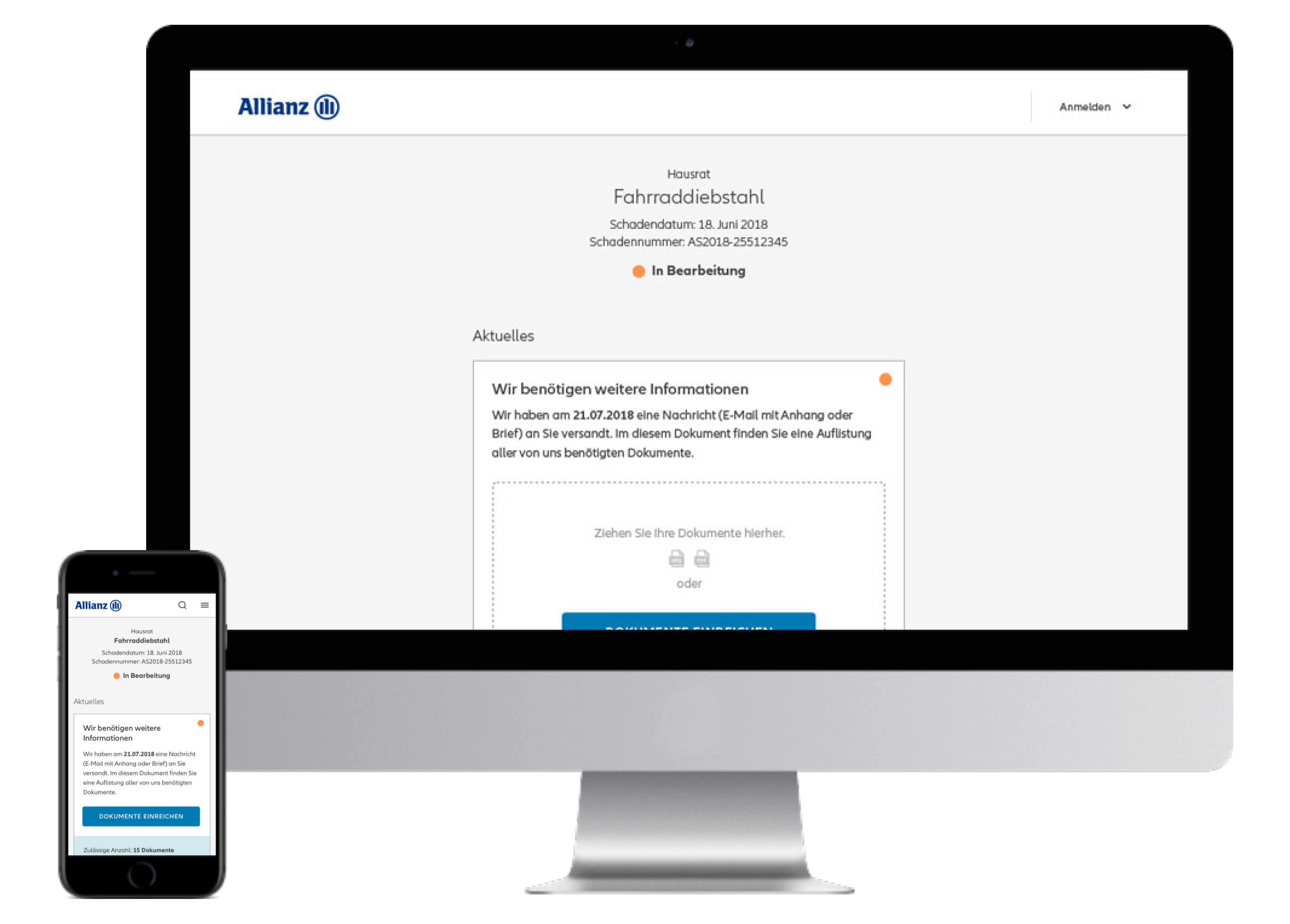
The Challenge
“Have they even received my claim?”
Users of the online claim form faced the same frustration patterns as health claim users:
- Most still sent claims by mail due to lack of feedback and trust
- They had no insight into where they were in the process
- The claim handling duration varied wildly (from days to weeks), with no explanation
- Unclear, inconsistent status messages led to frequent support calls
- Existing status updates (via email/SMS) were generic, incomplete and often late
- Users only learned about missing documents or rejected parts after processing
“I sent it last week. Should I do something? Or just wait? Or call?”
Research & Insights
Multiple usability tests revealed the emotional weight of the process. Users repeatedly asked the same questions:
- What has happened so far?
- What happens next?
- What do I need to do now?
- When will I get my money?
We also saw:
- Few users read long status texts
- Many expected proactive guidance, not just confirmation
- Positioning of contact options influenced whether users picked up the phone
- Persistent upload buttons confused users who had nothing else to submit
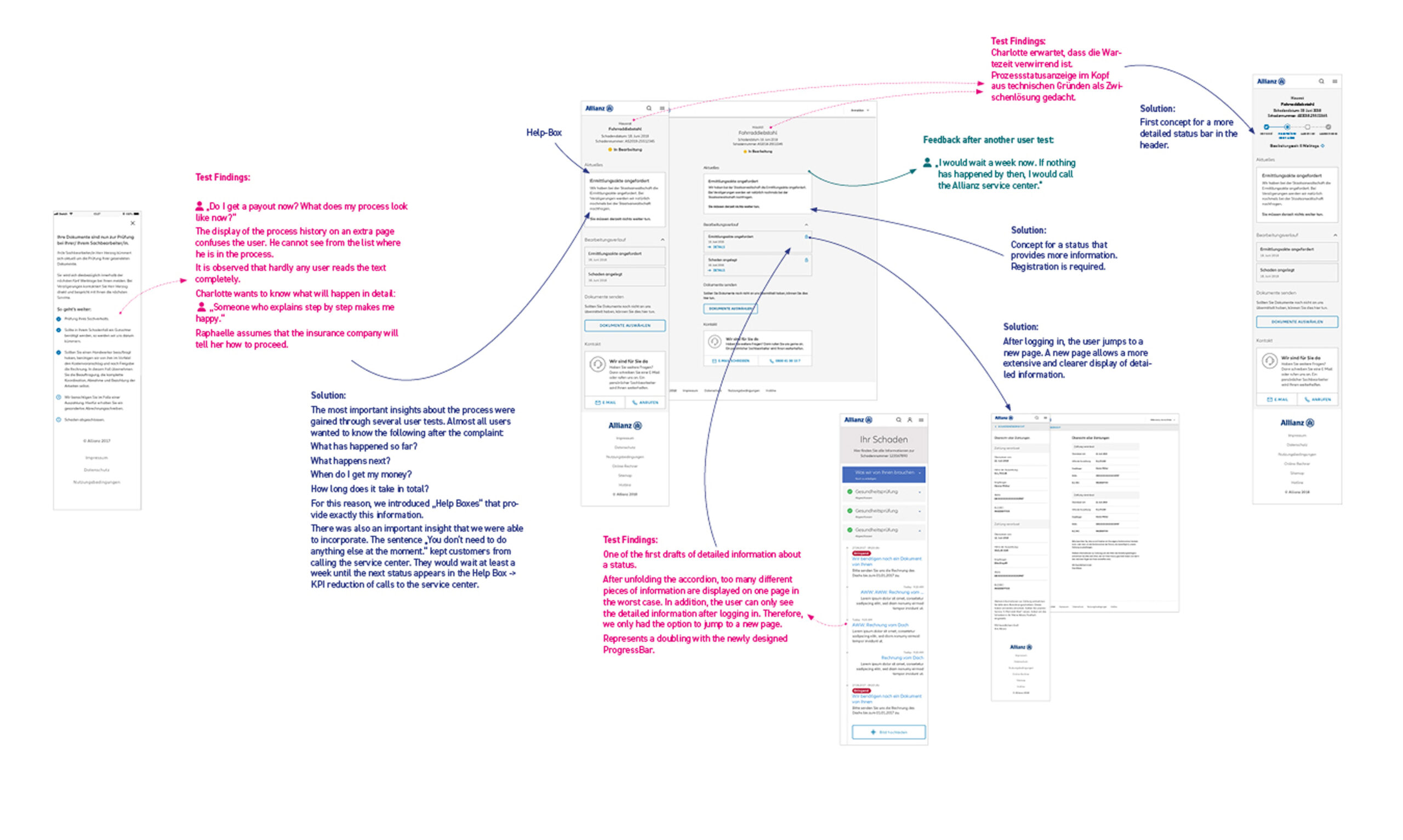
1. In the initial draft, users reported that they couldn’t clearly understand the steps in the process: What exactly was happening? When something would happen? What does the user have to do to speed up the process? and When they would receive their money? Based on this feedback, we developed the Help Box, which identifies the claim status by tracking sent emails. It was essential to clarify: What has happened so far? What happens next? How long will it take? And what actions the customer can take to speed up the process (e.g., submitting documents).
2. The first version featured a list of numerous status updates hidden behind accordions. Many users found this overwhelming and difficult to navigate. Since most of the information is only available when logged in and can be quite detailed, we decided to eliminate the accordions and direct users to a new page for easier access.
3. The temporary status display, consisting of a colored dot with accompanying text (e.g., „In Progress“), was unclear to some users. In a later development phase, we planned to introduce a progress bar with four stages: „Submitted,“ „In Progress“ (with detailed notes, such as „Lawyer Involved“), „Under Review,“ and „Completed.“
Strategy & Design Principles
Business Goals:
- Reduce support calls significantly
- Improve digital channel trust and satisfaction
- Increase NPS through perceived transparency
- Build a scalable model for other claim types
Product Goals:
- Deliver contextual status and task guidance
- Support step-by-step process overview
- Connect claims to email IDs for interim traceability
- Prevent unnecessary user action and contact
Design Principles:
- Visibility of process = reduced anxiety
- Use Help Boxes to communicate only what’s relevant
- “You don’t need to do anything now” is powerful copy
- Keep upload actions visible only when necessary
- Avoid passive UI – always show forward motion
The Solution
We didn’t just show status – we explained it, emotionally and contextually.
- Developed Help Boxes answering the 4 core user questions
- Connected status updates to email ID as a bridge before backend service was live
- Designed a new status interface with timeline, task and expectation logic
- Built interim logic to project expected resolution time per case type
- Reduced reliance on phone support by explicitly communicating inactivity
- Restructured contact elements to be secondary, not primary action
- Reduced complexity of uploads for users with no further documents
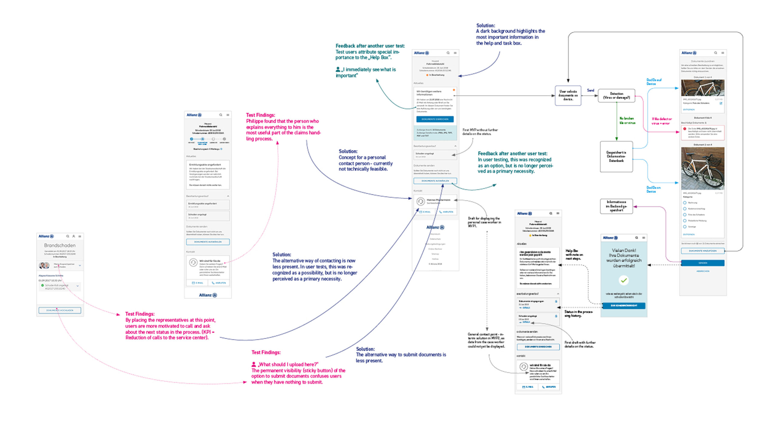
1. Placing the contact options at the top of the claims process led users to feel compelled to call instead of waiting for updates, which was contrary to our intention. As a result, we decided to move the contact section to the bottom and make it less prominent. This encouraged users to focus more on the help boxes.
2. A general contact option was not well received by users, as they expected a personal point of contact. Therefore, in a later development phase, it was planned to display the specific case handler.
3. A complex diagram illustrates how images are processed: sent to the backend, scanned for viruses and damage, stored in the backend upon passing, and information sent to the frontend. During the upload process, the frontend indicates whether everything went smoothly or if an error occurred, requiring the user to take further action. If successful, the next image (when uploading multiple images) is processed. After tapping or clicking „Submit,“ a message appears: „Thank you! Your documents have been successfully submitted.“ No further checks are needed, as each image is verified during the upload process.
What Changed
- 📉 –27% fewer support calls (Significant reduction in costs)
- 📈 NPS for the claims process rose significantly
- 😊 Users described the new flow as “calming”, “finally clear”, and “makes me feel taken seriously”
- 🕓 Status visibility helped users stay patient up to 7 days
- ✍️ “You don’t need to do anything now” copy became a key trust element
- 🔄 Help Box logic adapted for use in other digital processes
“Now I can just wait without worrying”
Reflection & Learnings
Great UX answers what people won’t ask out loud.
- This project taught me how much language clarity reduces support effort
- Users don’t need “more information” – they need less doubt
- Design is also expectation management, especially in uncertain timelines
- We turned backend limitations into an opportunity to communicate better
- Clear interim solutions can still feel professional and complete when phrased right
Get My Resume and Portfolio as Printable PDFs
Daniel Treufeld Senior Designer UX / UI